Case Study: Belden Inc.
Belden is a multi-generational industrial company that has made a name for itself in machine tools and universal joints.
The Challenge
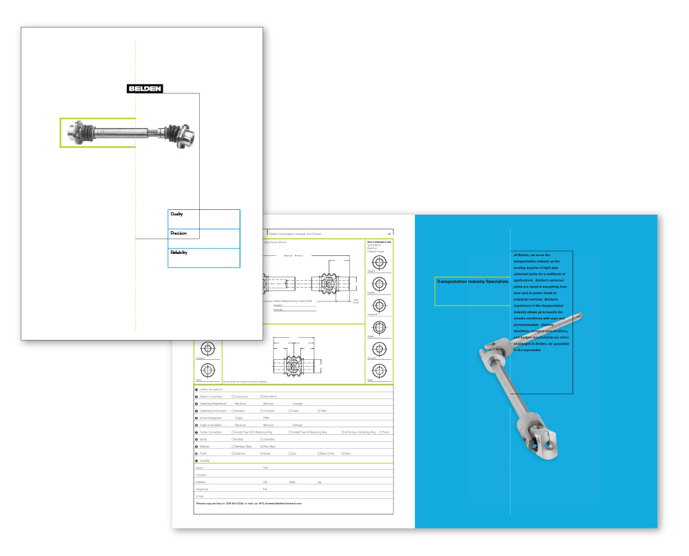
Quality. Precision. Reliability. These were all strong qualities of Belden as a company. However, they were also striving to escape a design identity that was old, dusty and antiquated. To address this inconsistency head on, Belden asked Hutchinson to build the foundation of a brand that would appear far more modern.
How Hutch Helped
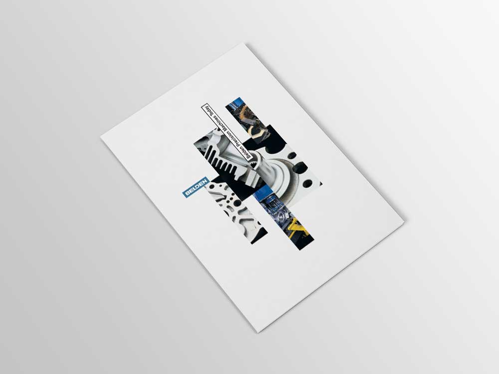
In guiding Belden through an in-depth strategic process, Hutchinson arrived at a corporate identity that was clean, bold and strong. A metallic ink element as part of the brand image conveyed a sharp, precision-oriented tone to reflect well on the company via its logo, business cards, letterhead and other elements.
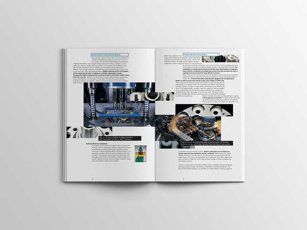
At Hutchinson, we pride ourselves on our ability to source and manage outstanding talent, which occurred as we moved beyond the immediate corporate identity elements into a full product catalog, In addition to providing our own photography, we saw the opportunity to bring in a photographer for other product shots. Every step of the way, Belden could have the peace of mind that a sophisticated project was in good hands and moving along a critical timeline.
Results
Our relationship with Belden began with one project – developing a logo for the company – and over the course of nearly 20 years, has grown into much more. Hutchinson has been entrusted to design a wide range of brand components, including advertising, marketing pieces, brochures and the company website.