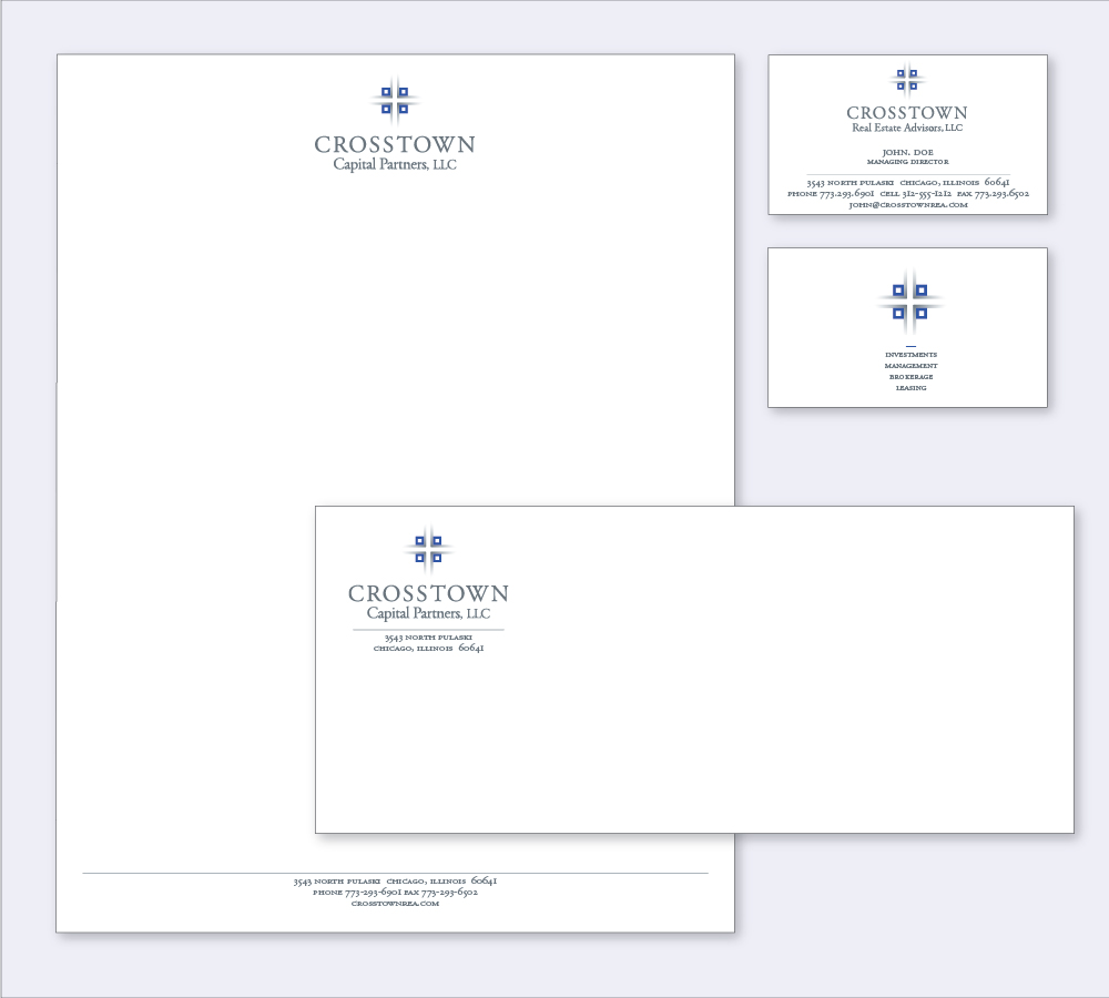
Case Study: Crosstown Capital Partners, LLC

Crosstown Capital Partners is a private real estate investment company that acquires commercial properties in the Midwest for its own portfolio, including retail, industrial, multi-family and mixed use spaces. Based on a meeting we’d had many years before while one of the founders was at another company, Crosstown engaged Hutchinson.
How Hutch Helped
Hutchinson brought a very strategic process upfront to help Crosstown work through its objectives, with interviews, competitive assessments and criteria development.
With one partner of Crosstown being a Cubs fan and other being a White Sox fan, we thought of how certain streets in Chicago – whether on the north side or south side of town – can often communicate a lot about the type of fan you are. Drawing from this imagery of streets and maps, Hutchinson built a consistent theme from the Crosstown brand across its corporate identity and website.
The Challenge
Upon launching the company, Crosstown was clearly in need of a more contemporary look and feel to its corporate identity to address the major touchpoints it would potentially have with its new customers and prospects. These touchpoints included the company logo, business cards, letterhead and website.
Results
There’s a certain satisfaction in saying you’ve worked with a company from the very beginning, as we have with Crosstown Capital Partners. In addition to that, the brand elements Hutchinson has developed for Crosstown has stood the test of time for many years, giving the company a strong, established brand foundation that it can continue to build its business upon for many years to come.

